What have they done? Government confirms COVID-19 Vaccination INCREASES risk of Death in all Age-Groups significantly
by
Robert Gorter, MD, PhD.
(with thanks to THE EXPOSÉ)
October 9th, 2022

The United Kingdom’s Office for National Statistics “the UK’s largest independent producer of official statistics and its recognized national statistical institute” has quietly released substantial data on the COVID-19 vaccines.
Despite containing some of the most detailed breakdowns of the relationship between the COVID-19 vaccines and mortality available, it has gone almost unnoticed.
We will try to present this data here using easily understood and transparent methods. With that said, the official UK Government data indicates substantially increased mortality rates in many individuals vaccinated with the COVID-19 vaccines, over the unvaccinated.
All-Cause Mortality by Vaccination Status: Analysis of UK Office for National Statistics Data
Table 1 of the dataset, “Monthly age-standardized mortality rates by vaccination status for all deaths, deaths involving COVID-19 and deaths not involving COVID-19, per 100,000 person-years, England; deaths occurring between 1 January 2021 and 31 January 2022”, looks as follows:
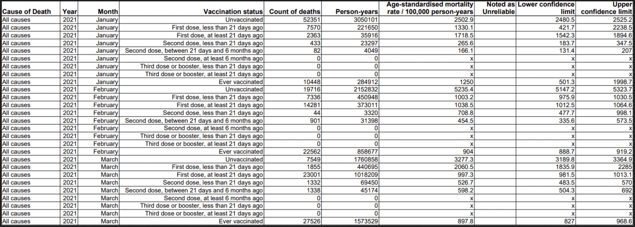
The significant column is “age-standardized mortality rate / 100,000 person-years”. It is age-standardized to minimize statistical problems with different amounts of vaccine uptake in different age brackets (more on that shortly). The number was calculated using person-years, so it can be understood as the expected number of deaths yearly per 100,000 population within the appropriate category.
There is data in this document for all-cause, COVID-19, and non-COVID-19 deaths. Looking at all-cause of death shows if vaccines are having a net positive or negative effect, so that is what we will do. As an extreme example, if per 100,000 people vaccines killed 999 from adverse events, but saved 1000 from COVID-19, the vaccinated group still would have a lower all-cause mortality rate than the unvaccinated.
If the January rate charted above held for a year, we would expect:
2502.9 deaths over the year per 100,000 unvaccinated
1,330.1 deaths over the year per 100,000 with 1 dose less than 21 days ago
1,718.5 deaths over the year per 100,000 with 1 dose at least 21 days ago
265.6 deaths over the year per 100,000 with 2 doses less than 21 days ago
166.1 deaths over the year per 100,000 with 2 doses at least 21 days ago
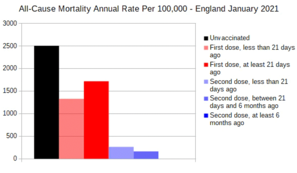
This is the effect nearly everyone expects the COVID-19 vaccines to have. The data shows an over 90% reduction in the mortality rate for those who took 2 doses at least 21 days ago. Keep in mind these are all-cause deaths. At the time there was a substantial likelihood that COVID-19 would have been the expected cause of death, for any unvaccinated deaths.
That was the earliest data in the set, January 2021. Now, look at the chart of the latest data in the set, January 2022.
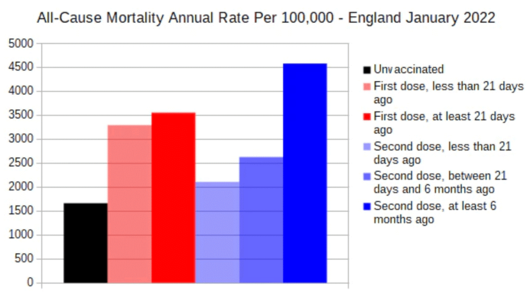
The all-cause mortality rate is substantially higher in those with 1 or 2 doses than in those unvaccinated. That does not seem like it could possibly be correct. Was it just some type of year-end accounting artifact?
Let’s plot the entire dataset as a timeline:
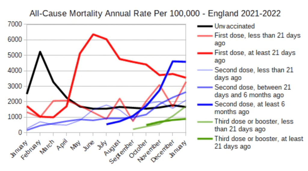
As we know in January 2021, those vaccinated with 1 and 2 doses have lower mortality rates than those unvaccinated. But then in May 2021 those vaccinated with 1 dose at least 21 days ago, start to have a higher mortality rate than those unvaccinated. In October 2021, those vaccinated with 2 doses at least 6 months ago started to have a higher mortality rate than those unvaccinated. They are followed in November 2021 by those with 2 doses at least 21 days ago. In addition, the mortality rate of those vaccinated with 3 doses is consistently getting closer to that of unvaccinated. All these trends continue through the end of the dataset in January 2022.
This clearly is not an accounting issue, so the obvious variable to look at is his age. Even though the Office for National Statistics says its data is age-standardized, the data must not account for age in a manner that shows what is really happening.
Table 2 has exactly what you need to look at more closely. The same mortality by vaccination status data is broken down into age bands of 18-39, 40-49, 50-59, 60-69, 70-79, 80-89, and 90+. we charted it the same way as above, but we removed the ‘less than 21 days ago’ categories as they add a lot of noise, and people will be in those groups only a short time compared to the at least 21 days ago’ categories. Additionally, the Office for National Statistics combined the ‘between 21 days and 6 months ago’ category with at least 6 months ago.
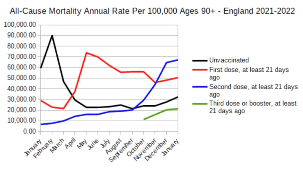
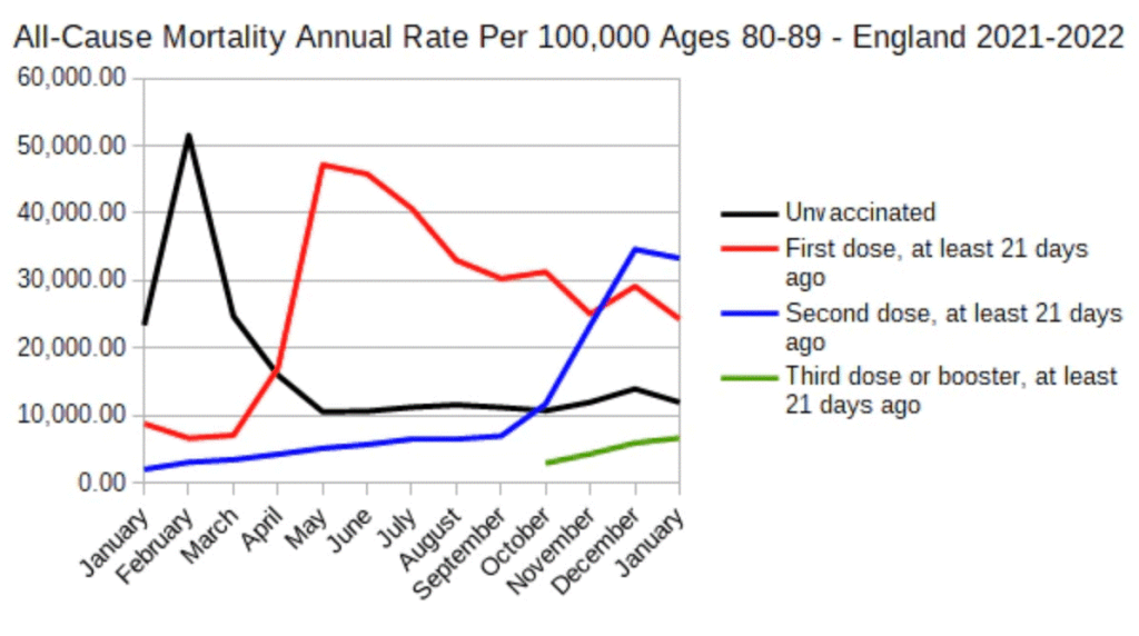
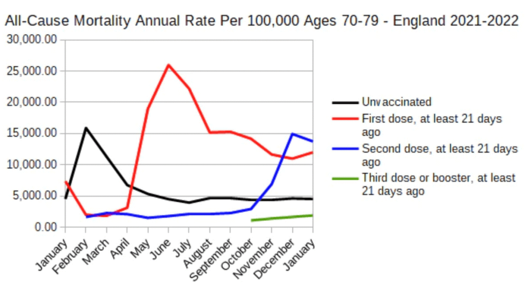
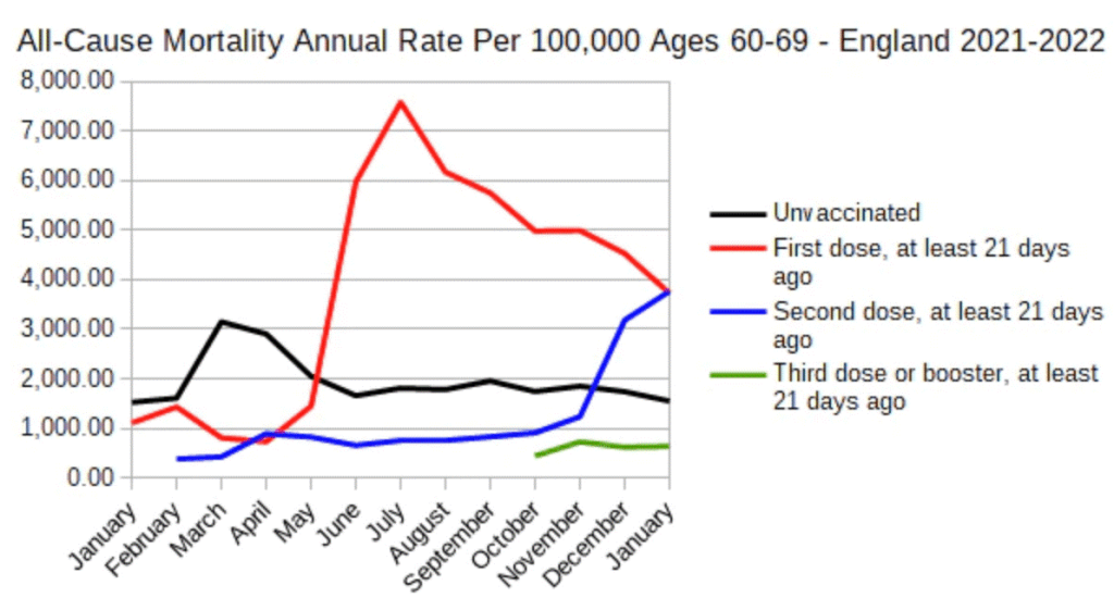
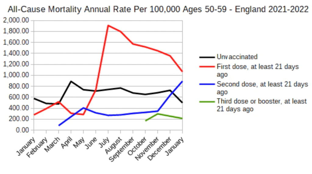

This data shows a few interesting things. Firstly, the effect seems to be real and consistent. Secondly, the effect occurs progressively later as age groups get younger. Thirdly, in ages 18-39 the vaccine seems to have had a negative effect from the start.
We would like to display all the above data in one chart, but the mortality rates are wildly different with 90,000 being the peak for 90+ while 120 is the peak for 18-39. For this reason, the data must be standardized first, which we do as ‘rate vs unvaccinated’.
For example, in January the 18-39 mortality rate of 120 for 1 dose vs 60 for unvaccinated, could be displayed as the 1 dose rate being 2x the unvaccinated rate. For 90+ the 30,000 rates for 1 dose vs 60,000 rates for unvaccinated, could be displayed as the 1 dose rate being 0.5x the unvaccinated rate. When the data is organized in that way and combined, you get the following chart.
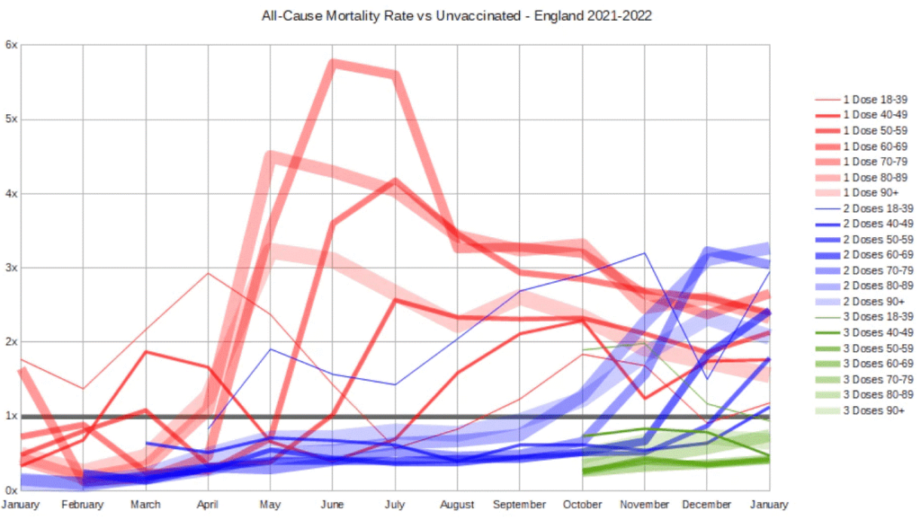
This data is all very alarming. A poorly functioning vaccine should still have at least a small positive effect. A non-functioning vaccine should have no effect. Yet we see a negative effect in all age groups for both 1 or 2 doses taken ‘at least 21 days ago’, and it is most cases the negative effect is quite large. The fact that the pattern is consistent and predictable, meaning it moves smoothly from month to month and age bracket to age bracket, gives even more credibility to the pattern.
The data indicates a great health concern that may be larger than COVID-19 itself, and it deserves immediate further analysis in a transparent and public way.